Why do some great books have dull/terrible covers?
You shouldn't judge a book by its cover, but great books deserve great covers!
What's the deal with some masterpieces having dull or outright terrible covers? The situation is especially bad in the case of sci-fi and fantasy. I am currently reading The Fifth Season by Nora K. Jemisin, which is not only a great sci-fi book, but generally a great literary work. I found the trilogy by looking at Hugo Award winners, but let's assume I was just browsing a book store and I see this:
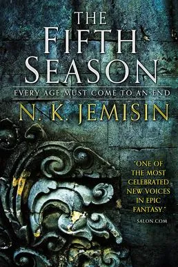
It is not great, not terrible, but it has some mediocre off the conveyor belt sci-fi/fantasy book vibes. It has no real identity.
The Hungarian edition (no longer in print) is a little better, maybe the font has some Diablo 2 vibes, but the obelisks and the colours are cool:

The German edition, on the other hand looks straight up like some cheap generic fantasy novel:

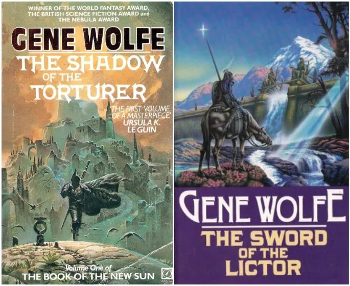
Does it have to be like this? No! The older editions of Gene Wolfe's Sun cycle has some jaw dropping covers, with so much identity, real pieces of art on their own:
I remember spending summers at my grandparents' place and finding old sci-fi books like this in the local library, I spent hours not only reading them, but looking at the cover. Some of them were a real psychedelic trip:

Impressive! Now let's see the newer editions of Gene Wolfe! Hmm -- to be be polite -- they are painful to look at:

I doubt anyone spends hours daydreaming while looking at the Temu Dark Brotherhood on this cover, lol.
I don't really have a point to be made, and with tens of thousands of books being published and republished, maybe I've just seen a thin, biased cross section of the market, but it still makes me kind of sad.
To repeat the catchphrase of this post: You shouldn't judge a book by its cover, but great books deserve great covers!